Shelbourne & Greer
Insulation specialists and accredited contractors for The Huntsman Group.


The Shelbourne & Greer logo is strong, modern and friendly. Utilising the contemporary typeface Raleway in bold weight and tight letterspacing brings a very close-knit, community-driven feel to the logo, communicating how Shelbourne & Greer look after those around them; their clients, staff, family. Reducing the spaces between the letters also cleverly communicates the nature of insulation, bringing an element of the product and services to the brand’s visual identity.

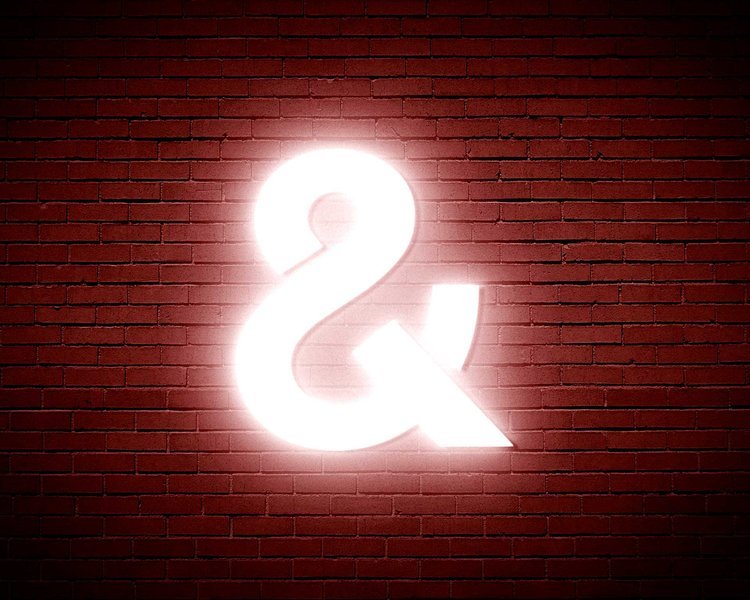

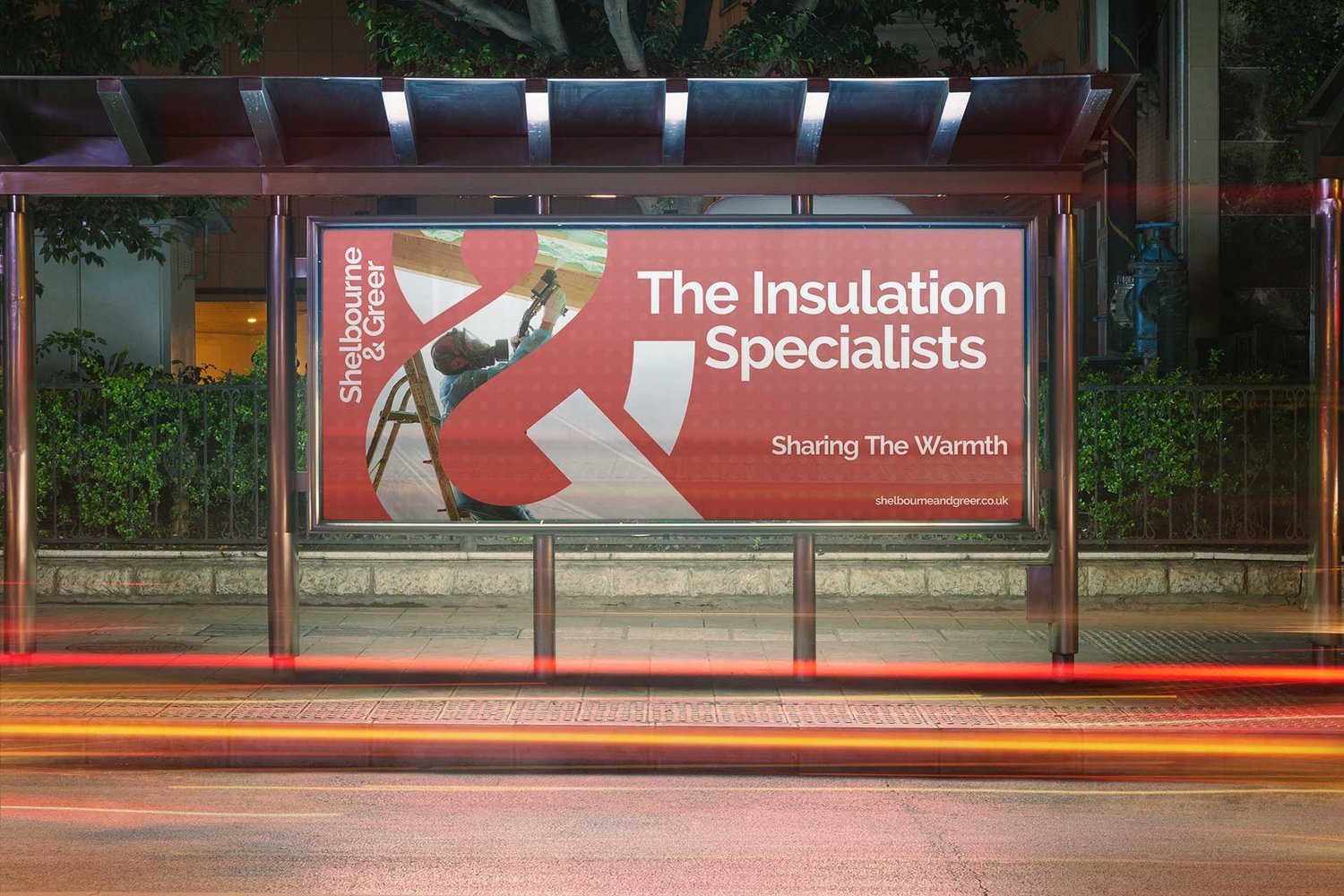
Shelbourne & Greer’s bespoke ampersand brand mark represents everything they’re about, bringing people together and looking after them. Taking the ampersand from the brand font and modifying it, we cleverly created a unique brand monogram using the letters S and G. Looking at the icon, you may see a graphical depiction of a swan, a predominantly monogamous creature that will spend years, or even a lifetime, with a single mate, further echoing the strong relationships they form with clients and those around them.

NEED OUR HELP?
Whether it's Branding, Design, Websites, Photography, Video, Print or Social Media, we can help you make an impact.