Sano
London based healthy eating restaurant offering great tasting, nutritionally dense, and balanced food.

Amidst the chaos of conflicting information about nutrition and the proliferation of food outlets claiming to offer healthy choices, Sano stands resolute in its mission to redefine healthy eating. Driven by an unwavering passion to enlighten customers about the true essence of nutrition, Sano aspires to revolutionise the way people perceive nourishment, offering a genuine, balanced, and science-based approach to food that transcends fads.


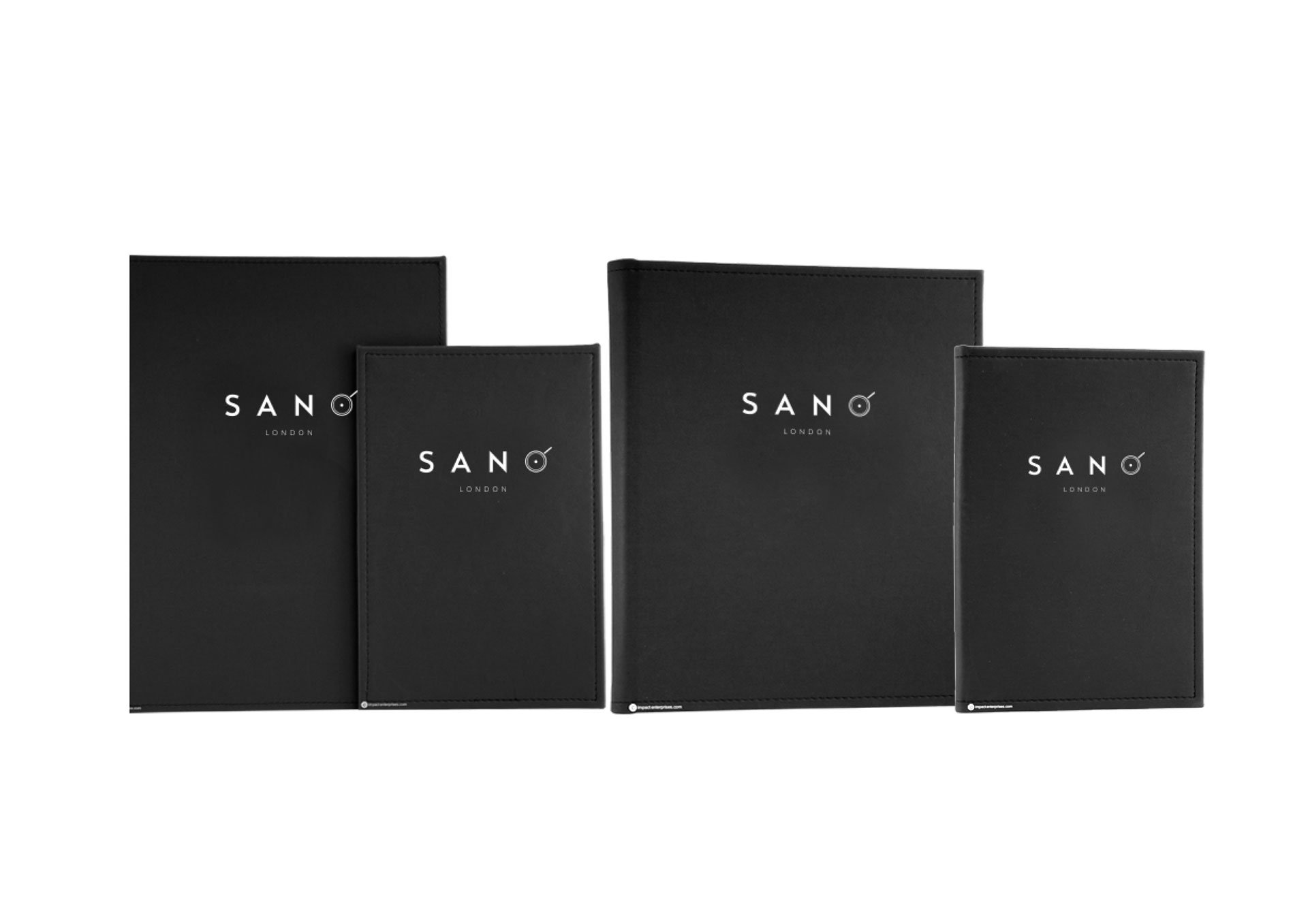

The logo's clean lines and unpretentious typography convey a sense of transparency, reflecting Sano's dedication to cutting through the confusion and misinformation that plague the realm of healthy eating. The focal point of the logo is a graphical icon concealed as an O showing a pan-cooking food – embodying the picture of cooking fresh, healthy food.


NEED OUR HELP?
Whether it's Branding, Design, Websites, Photography, Video, Print or Social Media, we can help you make an impact.